 |
| ||||||||||||||||||||||||||||||||||
Blog Entry# 801975
Posted: Jul 06 2013 (20:37)
3 Responses
Last Response: Jul 07 2013 (09:55)
3 Responses
Last Response: Jul 07 2013 (09:55)
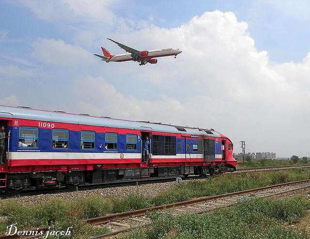
The Daily DEMU service to Delhi sarai rohilla
Gadihasur Delhi sarai rohilla AERODYNAMIC DEMU accelerates as a Boeing 777 descends to land at the Indira Gandhi International Airport,Delhi
By Dennis Jacob
Guys at Air India,should have covered the entire "Tail Section" with the rising sun theme.That would have really added much more bite to the "Beauty" and the fonts used by Air India equally look bad.Pretty flat and boxy....should have used more "Curvaceous" fonts.Love the "Orange" color to the hilt though which is really eye pleasing especially on a gloomy day and great snap to capture two modes of transportation in One By Dennis Jacob whom i assume is a member on this site.Thanks a lot for bringing it to us Gopal ji.
Thanks Siversurfer for your views.yes,Dennis Jacob is an IRI member and a regular contributor to Flickr.All credit goes to him for taking a memorable snap.
Travel SAFE
1. RailFanning does NOT MEAN dangerous pics/videos.
2. Doorplating pics/youtube videos are strictly FORBIDDEN in IRI.
3. Take plenty of food pics and other safe pics.
4. Write human interest narratives to make the pics interesting.
5. Enjoy blogging and travelling SAFELY.
REMEMBER: YOUR LIFE is the most precious thing, NOT RailFanning.
Scroll to Top