 |
| |||||||||||||||||||||||||||||||||||||||||||||
Thu Sep 26 19:49:48 IST
Trains
| ♥♥All Imaginary Trains♥♥ | ||
| New Trains | To Be Introduced | |
| Special | Pending | |
| Festival | Special Fare | |
| Bedroll/Linen | LHB Rakes | |
| Vande Bharat | ||
| Namo Bharatnew | Amrit Bharat | |
| Humsafar | Antyodaya | |
| Tejas | Uday | |
| Rajdhani | Shatabdi | |
| Duronto | Garib Rath | |
| Sampark Kranti | Jan Shatabdi | |
| Suvidha | Premium Tatkal | |
| AC Express | AC SuperFast | |
| Mail/Express | SuperFast | |
| Passenger | Toy | |
| MEMU/DEMU | Double Decker | |
| Delhi EMU | Hyderabad | |
| Chennai EMU | Kolkata EMU | |
| Mumbai EMU | Pune EMU | |
ΣChains
| All ΣChains |
Atlas
| Main |
PNR
| Main |
| PNR #Follows |
| Recent Refreshes |
| Recent Refresh Requests |
| Blank PNRs |
| New PNRs |
| Recent Predictions |
| Recent Stampings |
| Surprises |
| Past Un-Stamped |
| Today's PNRs |
| Today's Un-Stamped |
| Tomorrow's PNRs |
| Tomorrow's Un-Stamped |
Forum
| Main | #Follows |
| Travel Tips | |
| Timeline | Travelogues |
| Polls | Popular |
| UnAnswered | Archived |
| Imaginary Train Blogs | Race Blogs |
Quiz
| Main Quiz Feed |
Gallery
| All Pics |
| All Station Pics |
| All Train Pics |
| All Loco Pics |
News
| Main |
| Major Accidents/Disruptions |
| New/Special Trains |
| Official Press Releases |
| Crime |
| Rail Budget |
| Trains in the News |
| Stations in the News |
Trips
| Trip Highlights |
| All Trips |
| Today's Departures |
| Post PNR | Post Blog | Advanced Search |
Please wait...
Blog Entry# 5721462
Posted: May 13 2023 (00:43)
No Responses Yet
No Responses Yet
May 13 2023 (00:43) 20702/Tirupati - Secunderabad Vande Bharat Express | TPTY/Tirupati (6 PFs)
saisrikanth~
saisrikanth~ 1625 blog postsEntry# 5721462 Tags Past Edits
May 16 2023 (15:11)
Link for 20701TPTY-SC SC-TPTY VandeBharat analysis -
May 13 2023 (14:07)
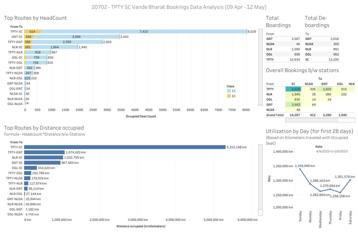
Data Analysis on 20702 TPTY-SC Vande Bharat based on first charts generated every day from inauguration till May 12th
Link for 20701 TPTY-SC VandeBharat analysis -
May 13 2023 (01:08)
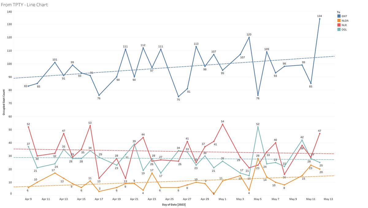
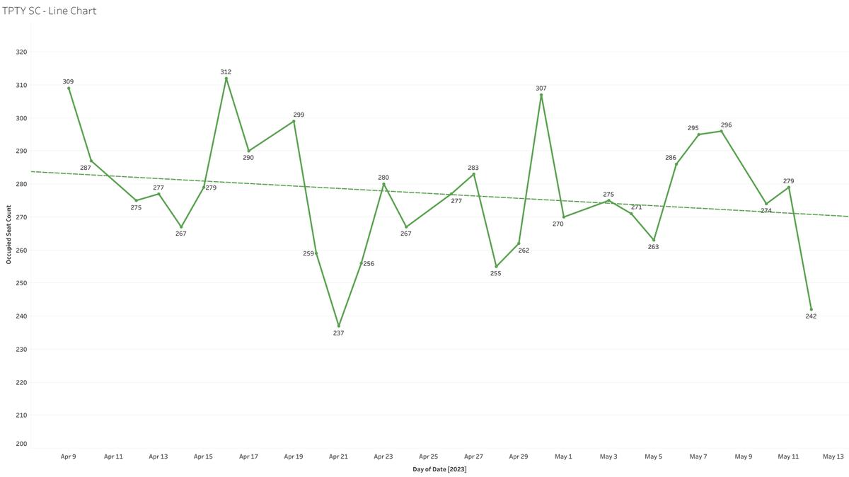
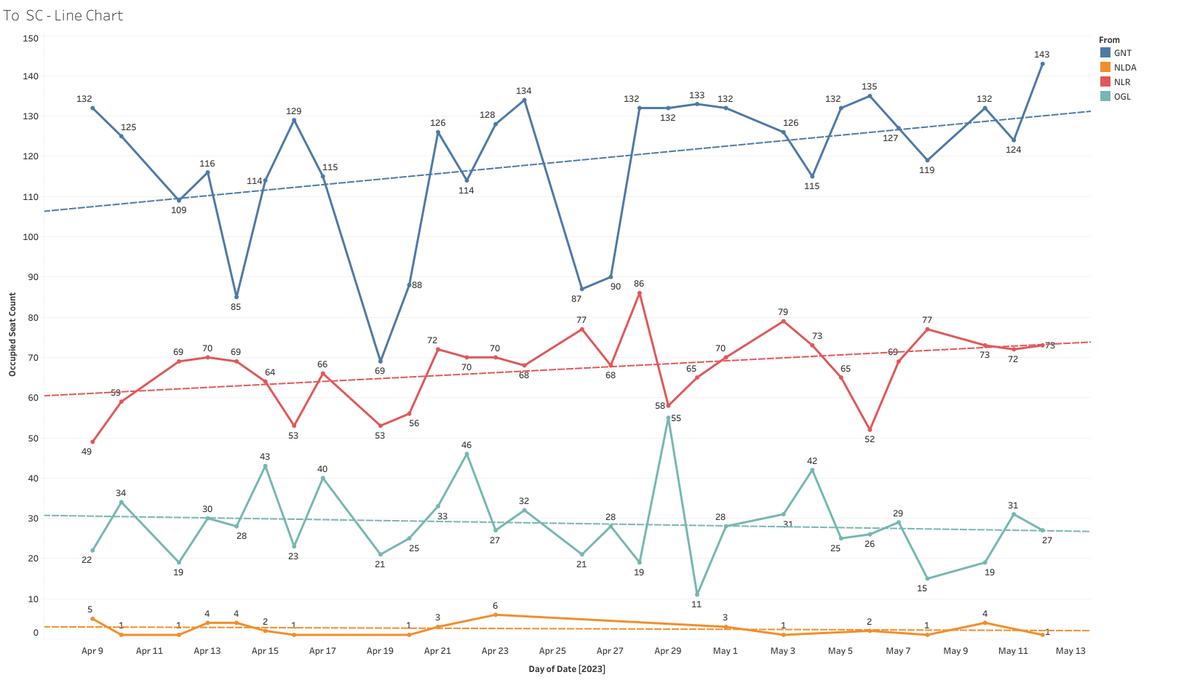
TPTY-SC Line chart - Shows count of people travelled from TPTY to SC every day
Dashboard link (best view on desktop/laptop) -
Link for 20701 TPTY-SC VandeBharat analysis -
May 13 2023 (00:45)
Link for 20701 TPTY-SC VandeBharat analysis -
Link for 20701
May 13 2023 (14:07)
Link for 20701 TPTY-SC VandeBharat analysis -
May 13 2023 (01:08)
TPTY-SC Line chart - Shows count of people travelled from TPTY to SC every day
Dashboard link (best view on desktop/laptop) -
Link for 20701 TPTY-SC VandeBharat analysis -
May 13 2023 (00:45)
Link for 20701 TPTY-SC VandeBharat analysis -
2 compliments
Useful Useful
Useful Useful
Analysis on 20702 TPTY-SC Vande Bharat based on first charts generated every day from inauguration till May 12th
1. Dashboard - Some insights
2. TPTY-SC Line chart - Shows count of people travelled from TPTY to SC every day
3....
more...
1. Dashboard - Some insights
2. TPTY-SC Line chart - Shows count of people travelled from TPTY to SC every day
3....
more...
From TPTY Line chart - Shows Count of people travelled from TPTY to various destinations (excluded SC - check 2)
4. To SC Line chart - Shows Count of people travelled to SC from various destinations (excluded TPTY - check 2)
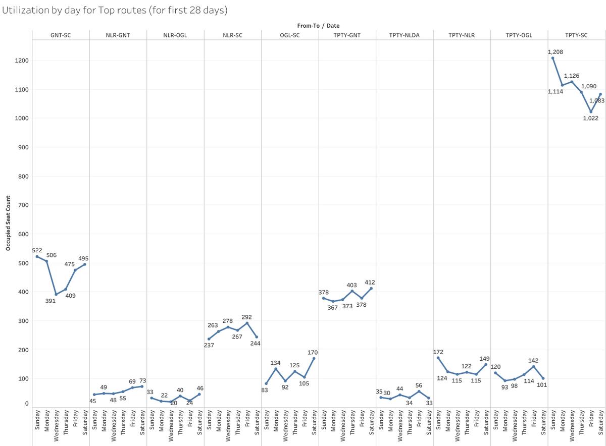
5. Utilization by day for some top routes
6. Excel Dataset (20702 Apr09 - May12)
Note - For points 2,3,4 there are dotted lines(trend line) in the line charts which basically shows upward/downward trend. It is tool suggested trend line which has around 90% accuracy. I haven't made any formula in the background or made some analysis on it and CANNOT suggest it as the best.
Dashboard link (best view on desktop/laptop) - click here
I'm trying to learn something on data analysis/data analytics, Any suggestions on these charts are welcome
Data Source - IRCTC online charts API
Link for 20701 SC-TPTY VandeBharat analysis - /blog/post/5721461
4. To SC Line chart - Shows Count of people travelled to SC from various destinations (excluded TPTY - check 2)
5. Utilization by day for some top routes
6. Excel Dataset (20702 Apr09 - May12)
Note - For points 2,3,4 there are dotted lines(trend line) in the line charts which basically shows upward/downward trend. It is tool suggested trend line which has around 90% accuracy. I haven't made any formula in the background or made some analysis on it and CANNOT suggest it as the best.
Dashboard link (best view on desktop/laptop) - click here
I'm trying to learn something on data analysis/data analytics, Any suggestions on these charts are welcome
Data Source - IRCTC online charts API
Link for 20701 SC-TPTY VandeBharat analysis - /blog/post/5721461
please wait...Translate to English
please wait...Translate to Hindi
Travel SAFE
1. RailFanning does NOT MEAN dangerous pics/videos.
2. Doorplating pics/youtube videos are strictly FORBIDDEN in IRI.
3. Take plenty of food pics and other safe pics.
4. Write human interest narratives to make the pics interesting.
5. Enjoy blogging and travelling SAFELY.
REMEMBER: YOUR LIFE is the most precious thing, NOT RailFanning.
Leading Polls
Top Trending Posts
| 6202070 ★ 8 | GaganB~ |
| 6202007 ★★ 20 | kaitlin2162 |
| 6190354 ★★★ 24 | Krishptil220~ |
| 6201942 ★ 9 | AbhinavECR |
| 6200591 ★★★ 28 | psanga_sur^~ |
| 6201977 ★ 11 | guest |
| 6201393 ★ 8 | LoveyouIndianRailw... |
| 6200376 ★★ 12 | AnkurRailfan~ |
| 6163452 ★ 10 | AdityaUnnao |
| 6201388 ★★ 12 | Kumaon_Tiger^~ |
| 6199822 ★ 6 | PankajMishra^~ |
| 6201757 ★ 9 | RahulKumarSharma~ |
| 6196243 ★★★ 82 | Yassshh~ |
| 6191902 ★★ 19 | shanzil.kabir^~ |
| 6201610 ★★ 12 | MeghaSyam^~ |
| 6199705 ★ 8 | SGRFC^~ |
| 6201819 ★ 8 | Siddharth98^~ |
| 6201805 ★ 7 | Siddharth98^~ |
| 6201348 ★ 10 | sivaprakashofficia... |
| 6201056 ★ 9 | AbhinavECR |
| 6198610 ★ 10 | Aidanus~ |
| 6201708 ★ 8 | Kumaon_Tiger^~ |
| 6201410 ★ 10 | SGUJ_20011^~ |
| 6191757 ★ 7 | shrikantagiwal~ |
| 6191869 ★★★ 108 | RahulKumarSharma~ |
| 6200457 ★★★ 39 | AdityaUnnao |
| 6201486 ★★ 14 | AbhinavKr^~ |
Rail News
- सीओ ने की जांच, एक सप्ताह में नाली निर्माण को कहा
News Entry# 571122
by: BanExynosProcessorsInIndia Today (19:44)
शिवसागर, एक संवाददाता। इ इ इ इ इ इ इ इ इ इ इ इ इ इ इ इ
... - पावापुरी स्टेशन पर आज से रुकने लगेगी श्रमजीवी एक्सप्रेस
News Entry# 571121
by: BanExynosProcessorsInIndia Today (19:42)
कोविड के बाद पावापुरी रोड स्टेशन पर श्रमजीवी ट्रेन का ठहराव बंद कर दिया गया था। स्थानीय लोगों और सांसद कौशलेन्द्र कुमार की मांग पर रेलवे ने 27 सितंबर से 30 नवंबर तक अस्थायी रूप से एक मिनट का ठहराव...
बिहारशरीफ,... - त्योहारों पर सामान चोरी के गिरोह का बढ़ जाता है आतंक, अब रेल पुलिस रहेगी मुस्तैद, तुरंत करेगी कार्रवाई
News Entry# 571120
by: BanExynosProcessorsInIndia Today (19:41)
रेल एसपी ने Local 18 को बताया कि अक्टूबर से शुरू होने वाले त्योहारों को लेकर ट्रेनों में भीड़ बढ़ने की उम्मीद है. इस दौ ...अधिक पढ़ें
... - छपरा से चलने वाली ट्रेनों का एक्स्ट्रा ठहराव:दुर्गा पूजा के मेले में मैहर स्टेशन पर रुकेगी रेल, देखें पूरी लिस्ट
News Entry# 571119
by: BanExynosProcessorsInIndia Today (19:39)
रेलवे प्रशासन नवरात्रि मेला के दौरान तीर्थ यात्रियों की सुविधा के लिए विभिन्न गाड़ियों का 5 मिनट का अस्थाई ठहराव मैहर स्टेशन पर देगी। इस दौरान छपरा से चलने वाली ट्रेनों का भी अस्थाई ठहराव दिया गया है। इससे छपरा से चलने वाले यात्रियों को मैहर स्टेशन पर
... - Railway News: त्यौहारों में गोरखपुर से पंजाब जाने वाले यात्रियों का सफर हुआ आसान
News Entry# 571118
by: BanExynosProcessorsInIndia Today (19:35)
शॉर्ट्स
फैक्ट...
New Trains
- Type: SFCSMT/Mumbai CSM Terminus to JP/Jaipur Junction
Run Dates: Sep 27 to Sep 28
Runs: Fri,Sat
Dep: 11:30 Arr: 08:45 +1
Updated: Today (13:05) - Type: ExpGAYA/Gaya Junction to JBP/Jabalpur
Run Dates: Sep 17 to Oct 02
Runs: Sun,Tue,Wed,Fri
Dep: 15:10 Arr: 08:00 +1
Updated: Today (09:13) - Type: ExpJBP/Jabalpur to GAYA/Gaya Junction
Run Dates: Sep 18 to Sep 28
Runs: Sat
Dep: 19:35 Arr: 08:20 +1
Updated: Today (09:09) - Type: ExpGAYA/Gaya Junction to RKMP/Rani Kamalapati (Habibganj)
Run Dates: Sep 19 to Sep 29
Runs: Tue,Thu
Dep: 15:10 Arr: 11:20 +1
Updated: Today (09:01) - Type: ExpGKP/Gorakhpur Junction to HSR/Hisar Junction
Run Date: ONLY ON Sep 26
Runs: Thu
Dep: 14:20 Arr: 08:30 +1
Updated: Today (00:24) - Type: ExpRKMP/Rani Kamalapati (Habibganj) to GAYA/Gaya Junction
Run Dates: Sep 16 to Oct 01
Runs: Mon,Sat
Dep: 13:20 Arr: 08:20 +1
Updated: Yesterday (20:42) - Type: ExpBJU/Barauni Junction to ANVT/Anand Vihar Terminal
Run Dates: Oct 07 to Nov 18
Runs: Mon
Dep: 08:00 Arr: 07:35 +1
Updated: Yesterday (20:07) - Type: ExpANVT/Anand Vihar Terminal to BJU/Barauni Junction
Run Dates: Oct 06 to Nov 17
Runs: Sun
Dep: 09:00 Arr: 06:30 +1
Updated: Yesterday (19:53) - Type: ExpGKP/Gorakhpur Junction to SDAH/Sealdah
Run Dates: Oct 06 to Dec 01
Runs: Sun,Tue
Dep: 11:30 Arr: 06:25 +1
Updated: Yesterday (19:11) - Type: ExpSDAH/Sealdah to GKP/Gorakhpur Junction
Run Dates: Oct 05 to Nov 30
Runs: Mon,Sat
Dep: 18:15 Arr: 10:10 +1
Updated: Yesterday (19:10)
Site Announcements
- Entry# 5648027
Mar 01 2023 (12:44AM)
In response to past confusions with Train/Station updates and resulting fights and controversies, the following clear and objective guidelines are being issued, with no room for any arguments or debates about validity. Also, included, some other changes with respect to Ratings. 1. All Red Ratings will require further explanation. Red Ratings won't... - Entry# 5388512
Jun 24 2022 (08:45AM)
As announced previously, there are a few changes coming to IRI user accounts, based on past practices. 1. As before, you will be able to quickly DELETE your IRI User account at ANY time. However, the menu option for this was hidden in the profile page, and could not easily be located.... - Entry# 5148000
Nov 29 2021 (06:40AM)
A new feature will be released soon, whereby you can follow blogs tagged with specific Trains & Stations. If you have already posted blogs tagged with some Train/Station, then you will be set to automatically follow that Train/Station. Thereafter, any future news/blogs tagged with those Trains/Stations will be marked to your... - Entry# 5093784
Oct 13 2021 (07:04AM)
These days, every other day, we are getting requests from members to allow email login to their FB-based IRI account. 10 years ago, we had given the option for users to login through FaceBook - in retrospect, this was a mistake. These days, apparently, users are quitting FaceBook in droves because... - Entry# 4906979
Mar 14 2021 (01:12AM)
Followup to: Fmt Changes The new version of FmT 2.0 will soon be here - in about 2 weeks. As detailed in the previous announcement, many of the old FmT features like Train TT, Speedometer, Geo Location, etc. will be REMOVED. It will be a bare-bones simple app, focused on trip blogging. It... - Entry# 4898771
Mar 06 2021 (10:33PM)
There are some changes coming to FMT. Many of the features of FMT, like station arrival, TT, speed, geo, passing times, station time, etc. are ALREADY available in OTHER railway apps. So all of these features will be REMOVED. We'll have ONLY BLOGGING - quick upload of pics/videos/audio, etc. You may attach...
Member Blog Links
Scroll to Top